Magic Grid
Magic Grid is a special grid used for images or articles and have a predefined behaviour depending on the screen resolution.
Default Style
This is the grid used to list blog categories and it is built using only CSS.
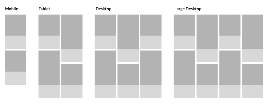
Magic Grid is built using .item elements, each item with an .image-sq container and a text container typo-sq.
<div class="magic-grid">
<div class="item">
<div class="item-inner">
<!-- image container -->
<div class="image-sq">
<div class="image-wrapper">
<div class="image-inner">
<img class="image-sq" src="assets/images/magic_grid/magic_grid_default_01.jpg" alt="">
</div>
</div>
</div>
<!-- text container-->
<a href="" class="typo-sq">
<span class="typo-whitespace"></span>
<p class="typo-label-sq" data-label-before="Category" data-label-after="Category"></p>
<p class="typo-title-sq">Food</p>
</a>
</div>
</div>
<div class="item"> ... </div>
...
</div>
Hover Effect
Magic Grid accepts three hover effects that can be applied together or separately. (default Magic container doesn't have a hover effect):
-
.hover-default - on hover, image from .item will note scale
-
.hover-scale - on hover, image from .item will scale
-
.hover-center - on hover, imagine from .item will have an overlay and text will center. This option allows you to have two text options for .typo-label, a default text (data-label-before) and one that appears on hover(data-label-after).
<div class="magic-grid hover-default">
...
</div>
Responsive Behaviour
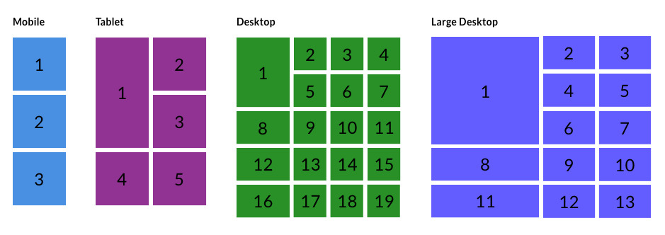
In its initial form, the grid has the (.items) elements as follows: three on a row on desktop and large-desktop resolution, two on a row on tablet resolution and one element on mobile.
Photo Style
Adding .photo-sq class the grid, will look like this:
<div class="magic-grid photo-sq hover-default hover-center">
...
</div>
Responsive Behaviour

Category Style
To achieve this style you need to add .category-sq class.
This style is another category/articles listing representation. In its initial form, the first element represents 1/3 from the container width and the rest of the categories will have 1/3 each from the remaining space.
<div class="magic-grid category-sq hover-scale hover-default">
...
</div>
Special Style
When applying .special class, the first element from the grid will have a bigger height than the container. Check it out in the following example:
<div class="magic-grid category-sq special-sq hover-scale">
...
</div>
Responsive Behavior
Article Style
By adding the .article-sq class, the grid will look like this:

Getting Cheap Airfare For Last Minute Travel
Nunc sit amet velit nibh. Proin consectetur, ante quis tristique mattis, massa massa condimentum enim.
read more
10 Steps To Look Younger
Nunc sit amet velit nibh. Proin consectetur, ante quis tristique mattis, massa massa condimentum enim.
read more
The Benefits And Drawbacks Of Buying Designer Kitchenware Products
Nunc sit amet velit nibh. Proin consectetur, ante quis tristique mattis, massa massa condimentum enim.
read more
Enhance Your Brand Potential With Giant Advertising Blimps
Nunc sit amet velit nibh. Proin consectetur, ante quis tristique mattis, massa massa condimentum enim.
read more
Counting Your Chicken Before They Hatch
Nunc sit amet velit nibh. Proin consectetur, ante quis tristique mattis, massa massa condimentum enim.
read more
Tesla to Build Three More Gigafactories
Nunc sit amet velit nibh. Proin consectetur, ante quis tristique mattis, massa massa condimentum enim.
read more
<div class="magic-grid article-sq hover-scale">
<div class="item">
<div class="item-inner">
<!-- image container -->
<a class="image-sq" href="#">
<span class="image-wrapper">
<span class="image-inner">
<img class="image-sq" src="assets/images/magic_grid/magic_grid_article_01.jpg" alt="">
</span>
</span>
</a>
<!-- typography container-->
<div class="typo-sq">
<span class="typo-whitespace"></span>
<p class="typo-label-sq" data-label-before="Travel" data-label-after="Book a home in"></p>
<p class="typo-title-sq">Getting Cheap Airfare For Last Minute Travel</p>
<p class="typo-desc-sq">Nunc sit amet velit nibh...</p>
<a href="" class="read-more-sq">read more <i class="icon icon-arrow-right-122"></i></a>
</div>
</div>
</div>
<div class="item"> ... </div>
....
</div>
Responsive Behavior
