Lorem ipsum dolor sit amet, consectetur adipiscing elit. Curabitur faucibus magna vel ex semper, in pharetra justo pulvinar. Donec non quam vitae justo mattis vestibulum a nec nisi. Morbi mi felis, ultrices vitae risus consectetur, porta ultrices sapien.
Nunc sit amet velit nibh. Proin consectetur, ante quis tristique mattis, massa massa condimentum enim, quis euismod arcu purus ac eros. Sed dictum elementum odio, id viverra est auctor nec.
Modals
Classic Modal
Modal element, in all cases, is actioned by a trigger that contains .modal-ui-trigger class and data-trigger-for attribute.
Modal specific class is .ui.modal and its structure looks like this:
- .header - for modal title
- .content - for modal content
- .footer - for buttons
- .close-modal - close trigger for this modal
Modal Title - Lorem ipsum dolor sit amet, consectetur
Lorem ipsum dolor sit amet, consectetur adipiscing elit.
<!-- Modal trigger -->
<a class="button-sq see-through-sq small-sq modal-ui-trigger" data-trigger-for="uimodal01">Classic Modal</a>
<!-- Modal -->
<div class="ui modal" data-for="uimodal01">
<i class="icon icon-close close-modal"></i>
<div class="header center">
<h4>Modal Title ... </h4>
...
</div>
<div class="content">
<p>...</p>
</div>
<div class="actions">
<div class="div-c inline-2">
<div class="divided-column">
<div class="button-sq cancel-sq fullwidth-sq">Cancel</div>
</div>
<div class="divided-column">
<div class="button-sq fullwidth-sq">OK</div>
</div>
</div>
</div>
</div>
Modal Options
Width
You can use .small, .large or .fullscreen classes for small, large or full-screen modals.
Small Classic Modal Large Classic Modal Fullscreen Classic ModalModal Title - Lorem ipsum dolor sit amet, consectetur
Lorem ipsum dolor sit amet, consectetur adipiscing elit.
Lorem ipsum dolor sit amet, consectetur adipiscing elit. Curabitur faucibus magna vel ex semper, in pharetra justo pulvinar. Donec non quam vitae justo mattis vestibulum a nec nisi. Morbi mi felis, ultrices vitae risus consectetur, porta ultrices sapien.
Nunc sit amet velit nibh. Proin consectetur, ante quis tristique mattis, massa massa condimentum enim, quis euismod arcu purus ac eros. Sed dictum elementum odio, id viverra est auctor nec.
Modal Title - Lorem ipsum dolor sit amet, consectetur
Lorem ipsum dolor sit amet, consectetur adipiscing elit.
Lorem ipsum dolor sit amet, consectetur adipiscing elit. Curabitur faucibus magna vel ex semper, in pharetra justo pulvinar. Donec non quam vitae justo mattis vestibulum a nec nisi. Morbi mi felis, ultrices vitae risus consectetur, porta ultrices sapien.
Nunc sit amet velit nibh. Proin consectetur, ante quis tristique mattis, massa massa condimentum enim, quis euismod arcu purus ac eros. Sed dictum elementum odio, id viverra est auctor nec.
<div class="ui modal small" data-for="uimodal02">
...
</div><div class="ui modal large" data-for="uimodal03">
...
</div><div class="ui modal fullscreen" data-for="uimodal04">
...
</div>
Background
For a modal that has no background you can use basic class.
Basic Classic ModalModal Title - Lorem ipsum dolor sit amet, consectetur
Lorem ipsum dolor sit amet, consectetur adipiscing elit.
Lorem ipsum dolor sit amet, consectetur adipiscing elit. Curabitur faucibus magna vel ex semper, in pharetra justo pulvinar. Donec non quam vitae justo mattis vestibulum a nec nisi. Morbi mi felis, ultrices vitae risus consectetur, porta ultrices sapien.
Nunc sit amet velit nibh. Proin consectetur, ante quis tristique mattis, massa massa condimentum enim, quis euismod arcu purus ac eros. Sed dictum elementum odio, id viverra est auctor nec.
<div class="ui modal basic" data-for="uimodal05">
...
</div>
For a background in modal header, you need to add to the structure a new section .modal-background.
Classic Modal with Background inside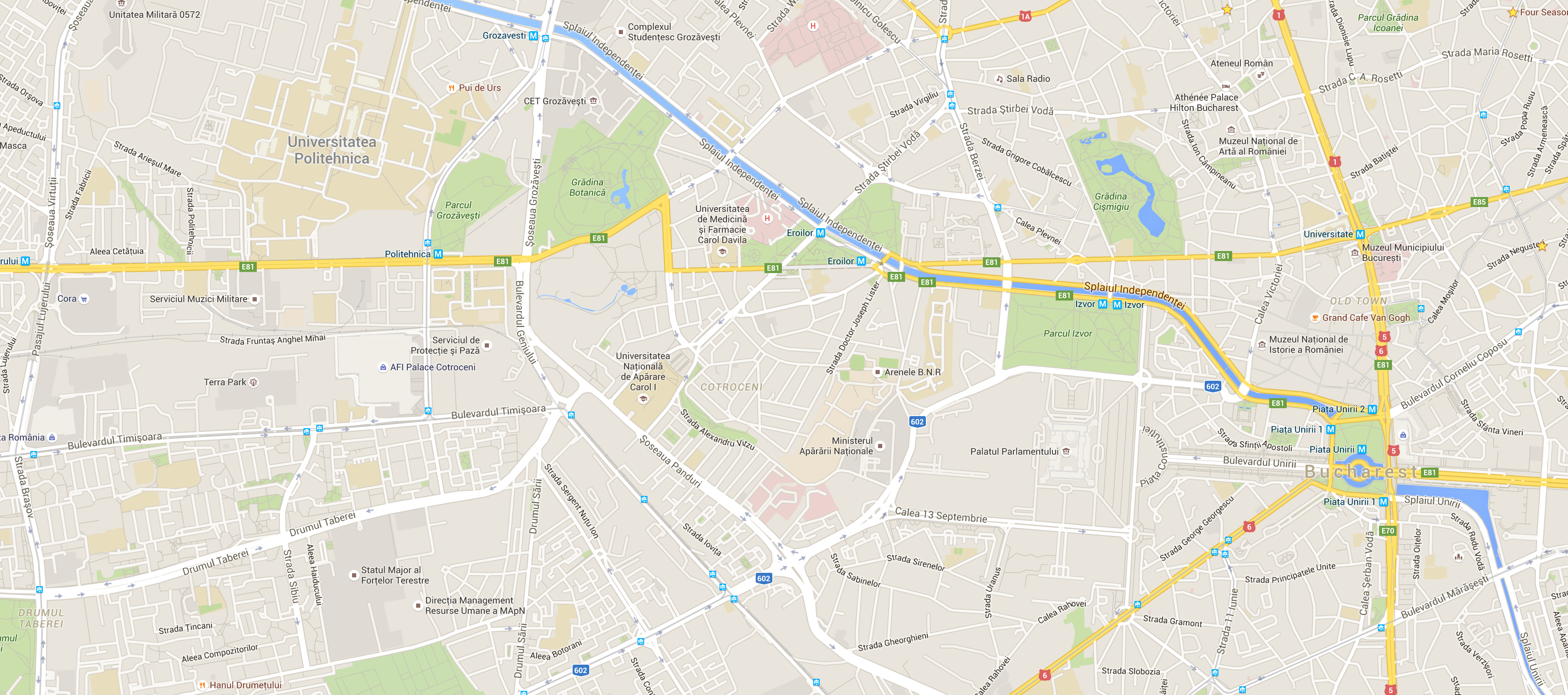
Modal Title - Lorem ipsum dolor sit amet, consectetur
Lorem ipsum dolor sit amet, consectetur adipiscing elit.
Lorem ipsum dolor sit amet, consectetur adipiscing elit. Curabitur faucibus magna vel ex semper, in pharetra justo pulvinar. Donec non quam vitae justo mattis vestibulum a nec nisi. Morbi mi felis, ultrices vitae risus consectetur, porta ultrices sapien.
Nunc sit amet velit nibh. Proin consectetur, ante quis tristique mattis, massa massa condimentum enim, quis euismod arcu purus ac eros. Sed dictum elementum odio, id viverra est auctor nec.
<div class="ui modal" data-for="uimodal06">
<div class="modal-backgound">
<img src="assets/images/modal/map.png" alt="">
</div>
</div>
Full-screen Picture Modal
Using .full class will add a full-screen image background that opens with an animation.
Full-screen Picture Modal
Log In
Lorem ipsum dolor sit amet, consectetur adipiscing elit. Curabitur faucibus magna vel ex semper, in pharetra justo pulvinar.
<div class="ui modal full" data-for="uimodal07">
<i class="icon icon-close close-modal"></i>
<div class="modal-full-background">
<img src="assets/images/modal/modal_background_001.jpg" alt="">
</div>
<div class="header center"> ... </div>
<div class="content"> ... </div>
<div class="actions"> ... </div>
</div>
Welcome Modal
Welcome modal is a specia style and looks like in the below example:
Welcome Modal
WECOME to MyBnb
Lorem ipsum dolor sit amet, consectetur adipiscing elit. Curabitur faucibus magna vel ex semper, in pharetra justo pulvinar.
start exploring
<div class="ui full modal welcome" data-for="uimodal08">
<div class="modal-full-background">
<img src="assets/images/modal/modal_background_001.jpg" alt="">
</div>
<i class="icon icon-close close-modal"></i>
<div class="welcome-wrapper">
<h2><span>WECOME</span> to MyBnb</h2>
<p>Lorem ipsum dolor ... </p>
<a href="" class="exploring-link">
<i class="icon icon-compass"></i>
start exploring</a>
</div>
</div>